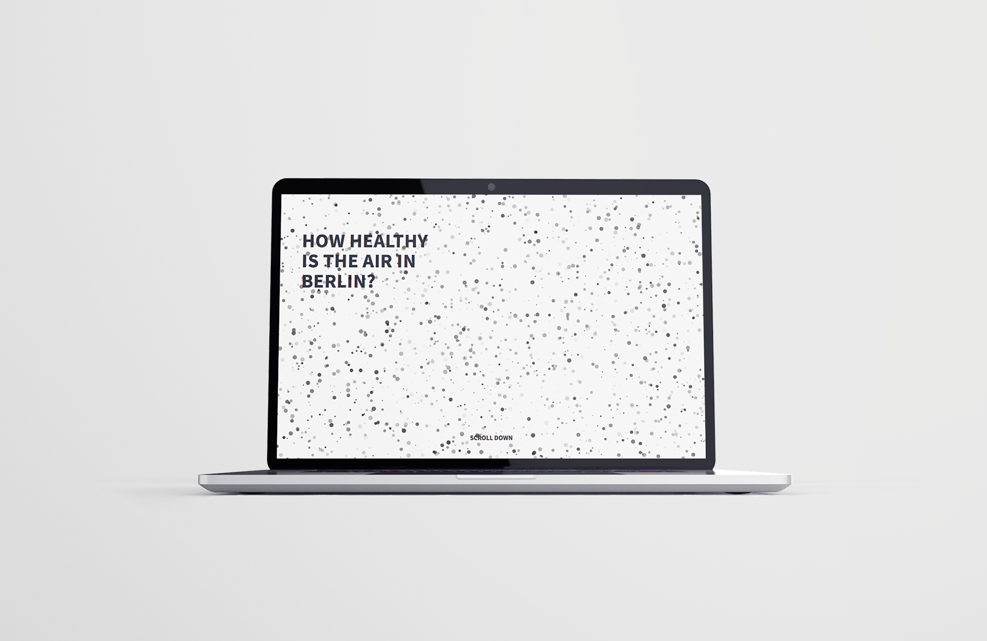
How healthy is the air in Berlin?
Cars dominate the street image of Berlin.
As people become more aware of the importance of sustainable environments, concerns about air pollution caused by heavy car traffic in capital cities such as Paris, Amsterdam, and Vienna have been raised.
How healthy is the air in Berlin, and how high is the level of particulate matter pollution?
As people become more aware of the importance of sustainable environments, concerns about air pollution caused by heavy car traffic in capital cities such as Paris, Amsterdam, and Vienna have been raised.
How healthy is the air in Berlin, and how high is the level of particulate matter pollution?
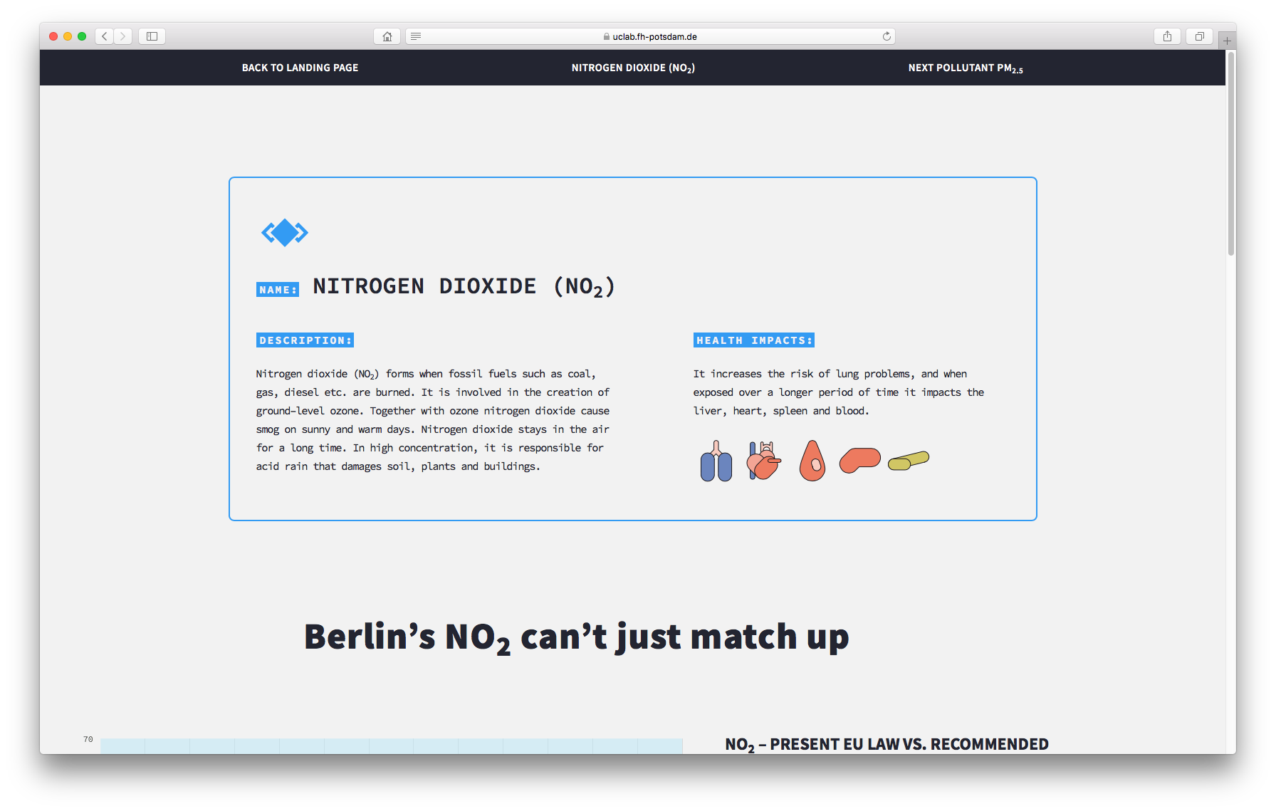
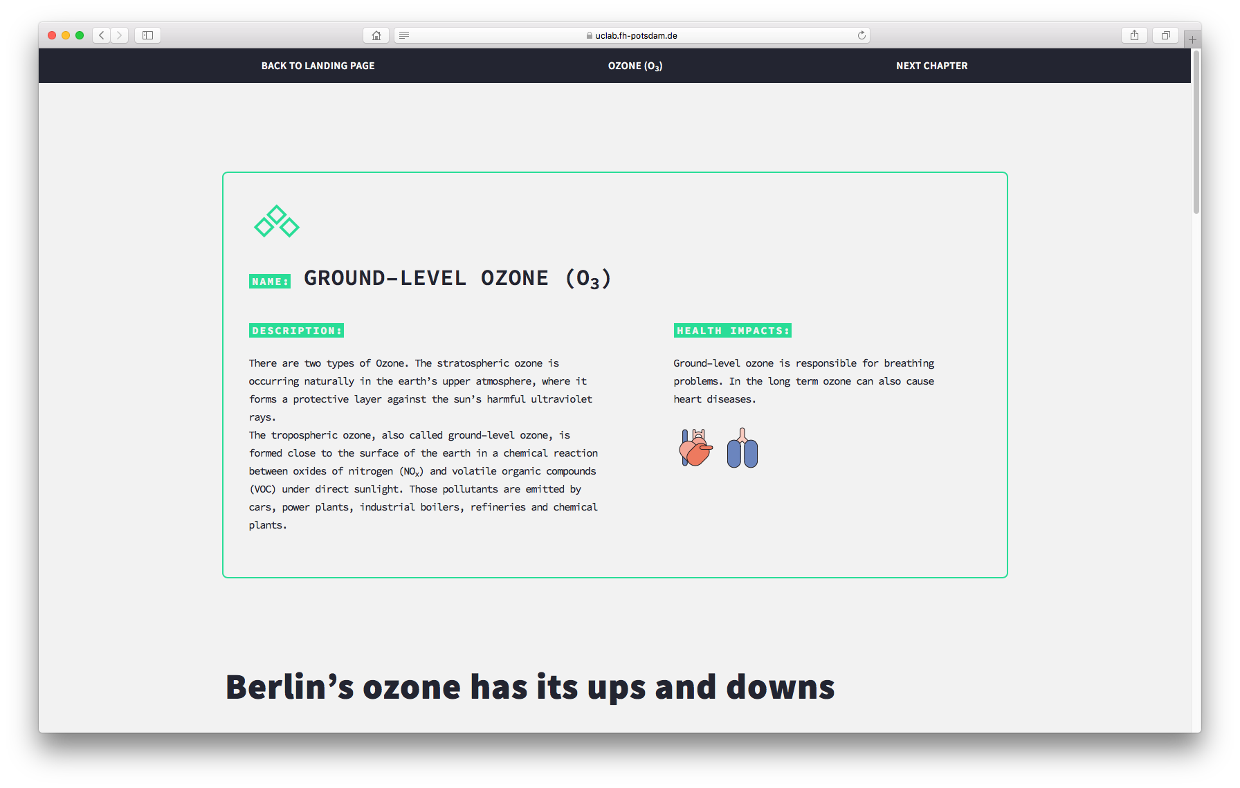
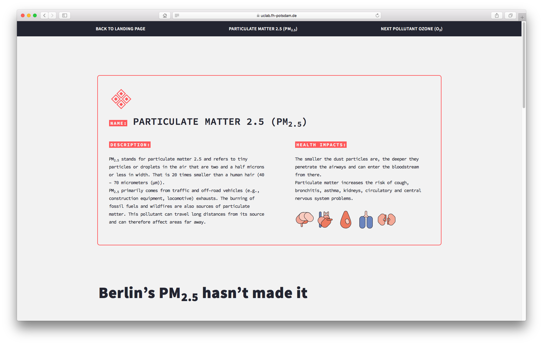
What are the health impacts of air pollution?
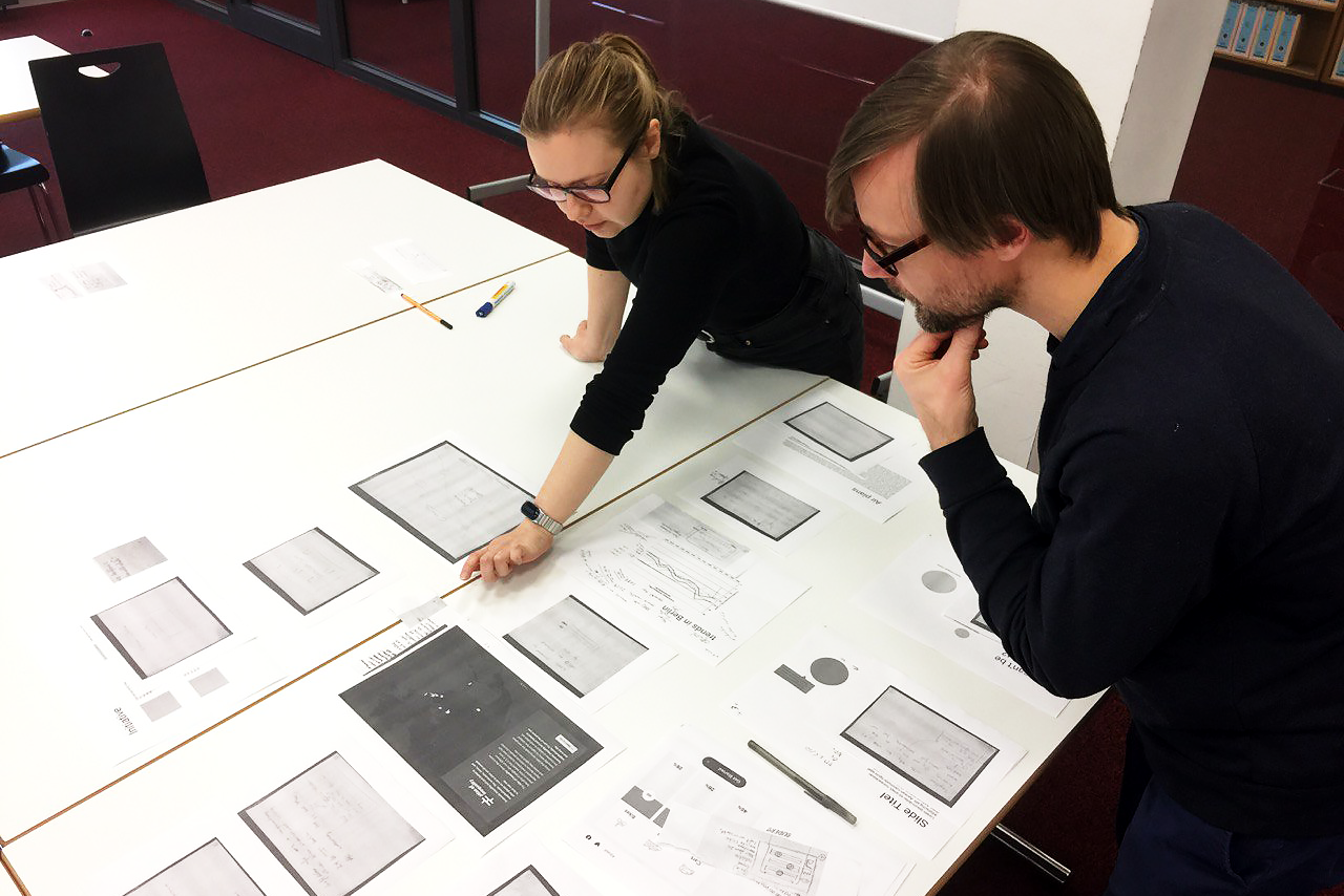
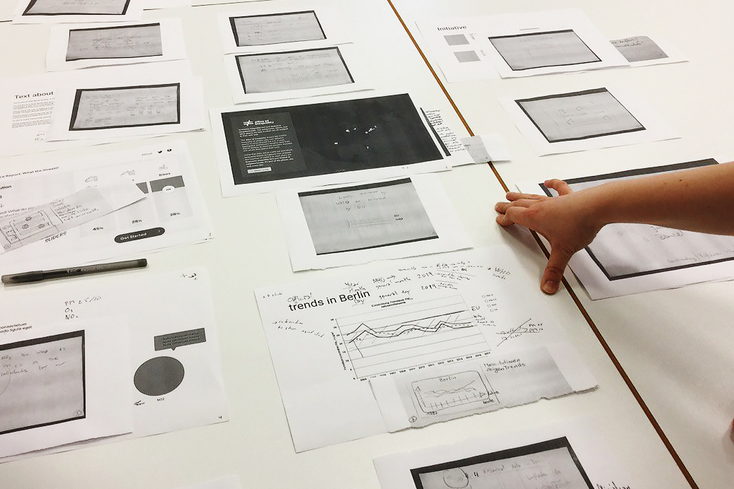
About the project
The data journalism and visualization project “How healthy is the air in Berlin” was developed as part of the “Mapping Cities – Making Cities” course by Prof. Dr Marian Dörk.
The result of the teamwork effort was a website with infographics about “harmful air pollution in Berlin”, “the health impacts of air pollution”, and “how much air pollution is measured in Berlin”.
My Role
I was responsible for designing the front-end of this project. I was involved in managing several things in the web project, such as HTML, CSS, and npm packages. I also helped in the web development onboarding process so we could work together and synchronize our work in a code development space on GitHub. Additionally, I provided guidance to the team on how to put content on the project website.
As a team of three students, we collaborated on designing the website narrative and conducted research together.
The Berlin map and charts were created by Maryna Honscharenko, while Daniel Almgren Recén was responsible for writing the texts and conducting research.
The Berlin map and charts were created by Maryna Honscharenko, while Daniel Almgren Recén was responsible for writing the texts and conducting research.
Landingpage
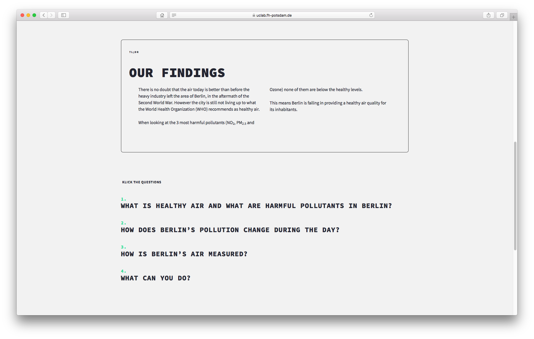
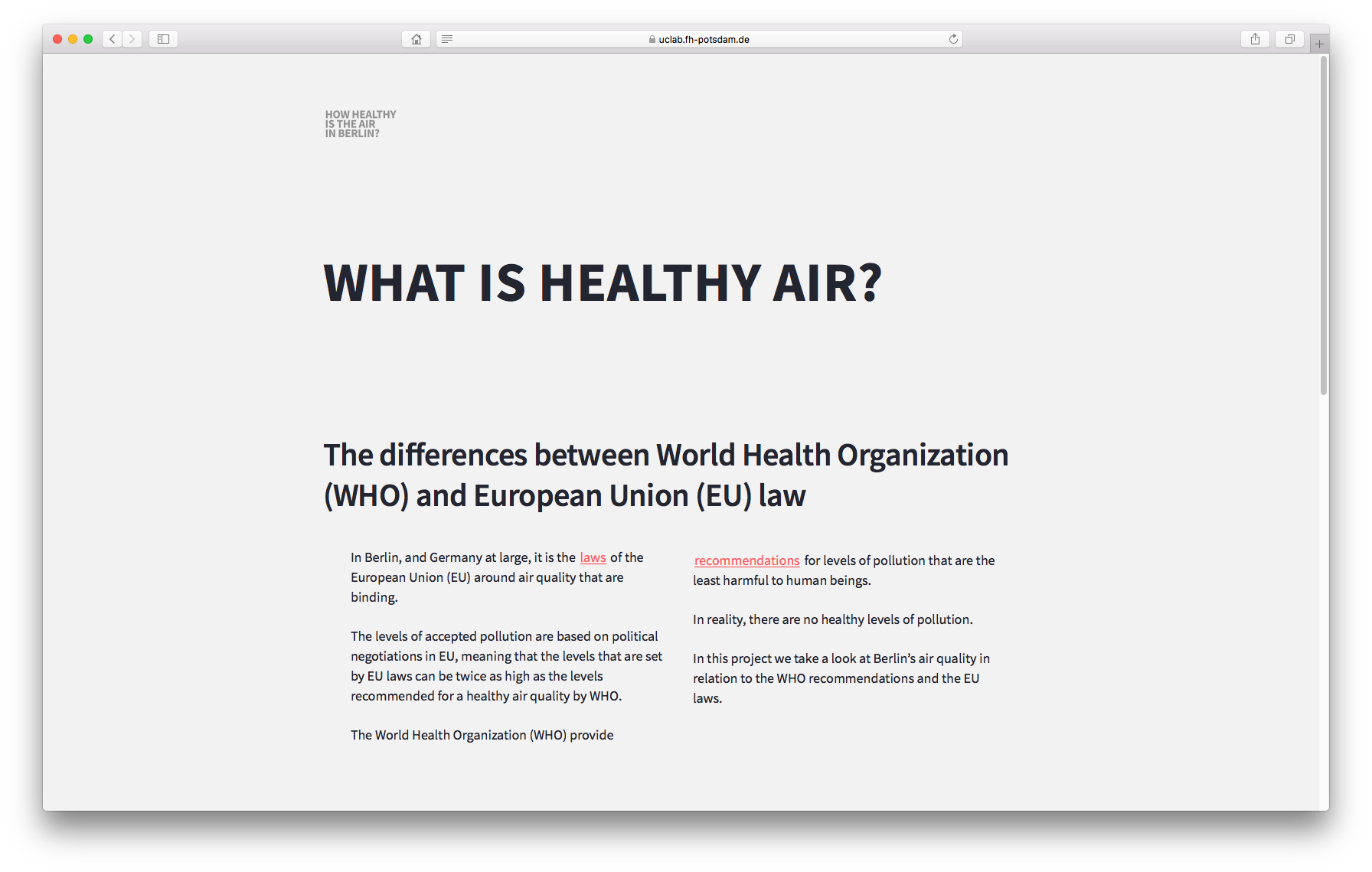
1. WHAT IS HEALTHY AIR?
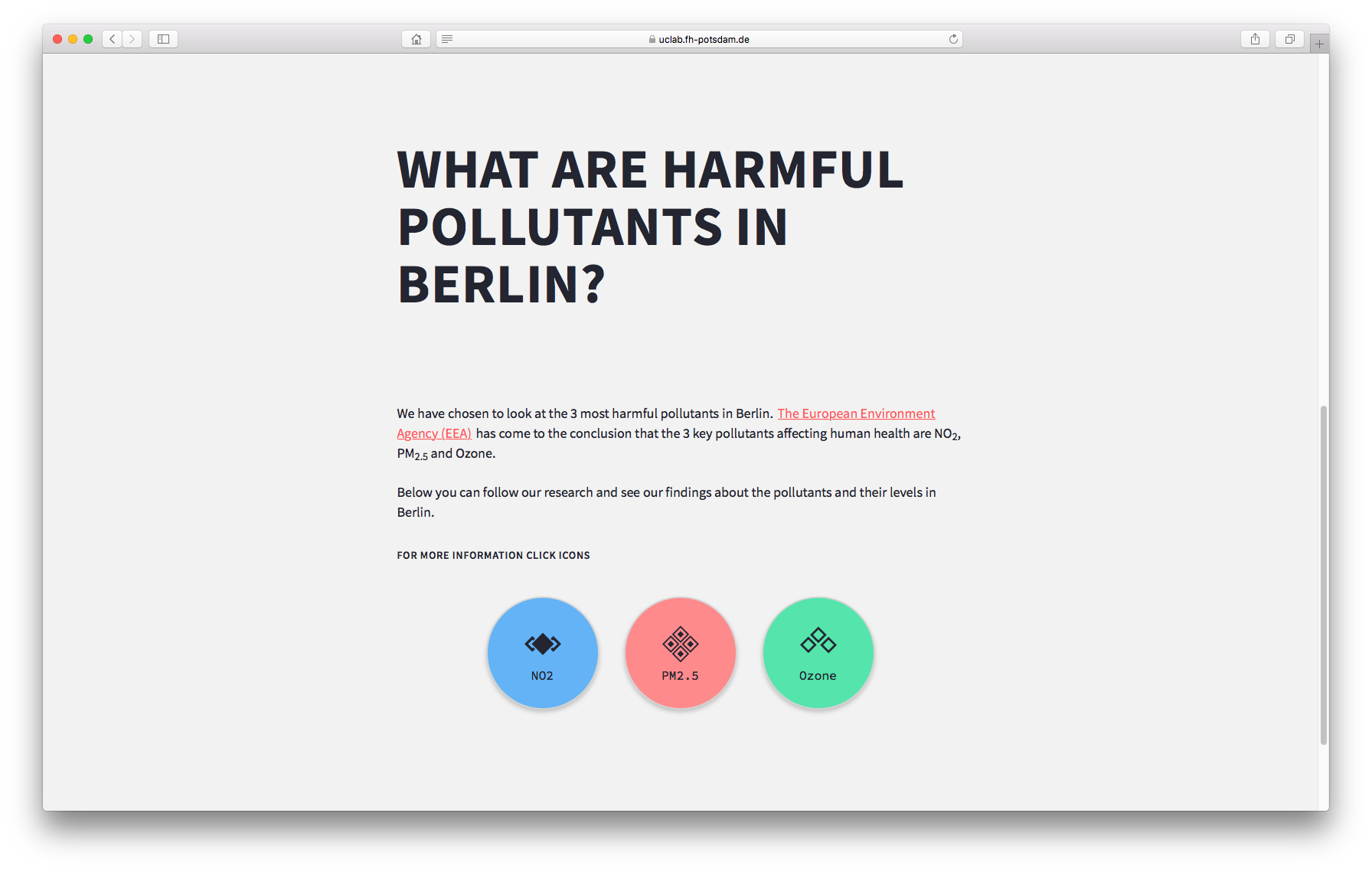
2. POLLUTANTS IN BERLIN
3. HOW DOES BERLIN’S POLLUTION CHANGE DURING THE DAY?
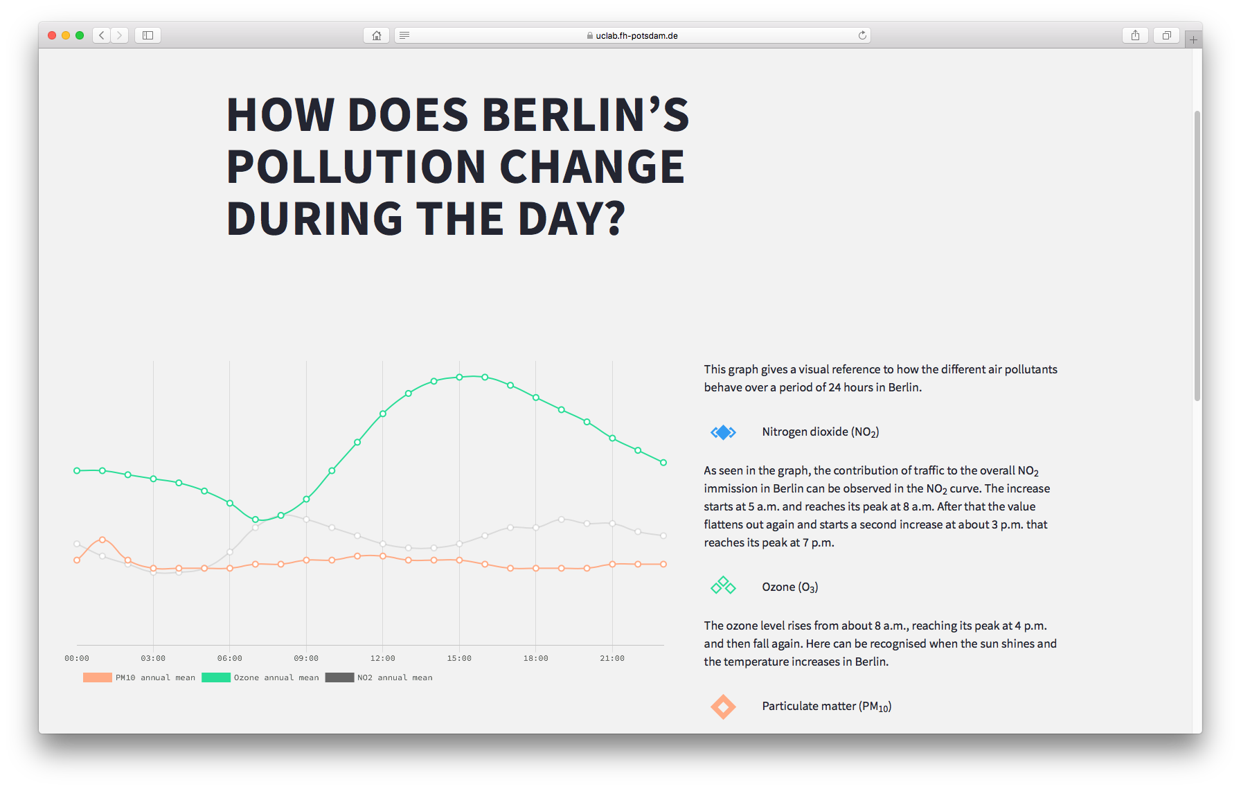
Infographic chart about how the different air pollutants behave over a period of 24 hours in Berlin.
The air data spread over a whole year and summarised on an average day in Berlin. Especially to see the peak of New Year's Day at 1:00 AM.
4. HOW IS BERLIN’S AIR MEASURED?
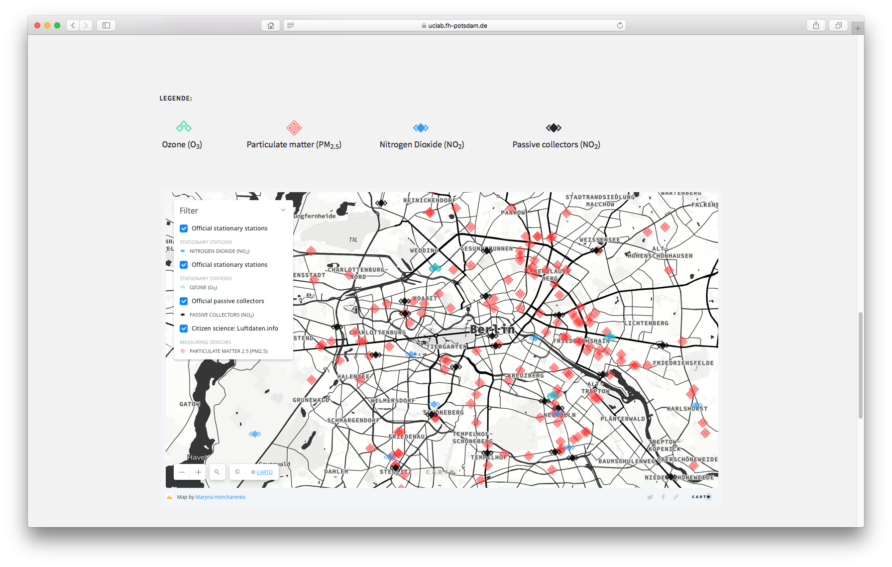
CARTO map about the air measuring points in Berlin, created by Maryna Honscharenko.
5. WHAT CAN YOU DO?
Team
particle animation on the title screen.
Credits
• Jens Drößiger (web development and graphics)
• Maryna Honscharenko (research, charts, Berlin map and writing)
• Daniel Almgren Recén (research and writing)
• Supervised by Prof. Dr. Marian Dörk
• Winter term 2019/2020 – date of publication: 21.02.2020
https://uclab.fh-potsdam.de/mapping/airberlin/
• Maryna Honscharenko (research, charts, Berlin map and writing)
• Daniel Almgren Recén (research and writing)
• Supervised by Prof. Dr. Marian Dörk
• Winter term 2019/2020 – date of publication: 21.02.2020
https://uclab.fh-potsdam.de/mapping/airberlin/