Chefkoch – Redesign
About the task
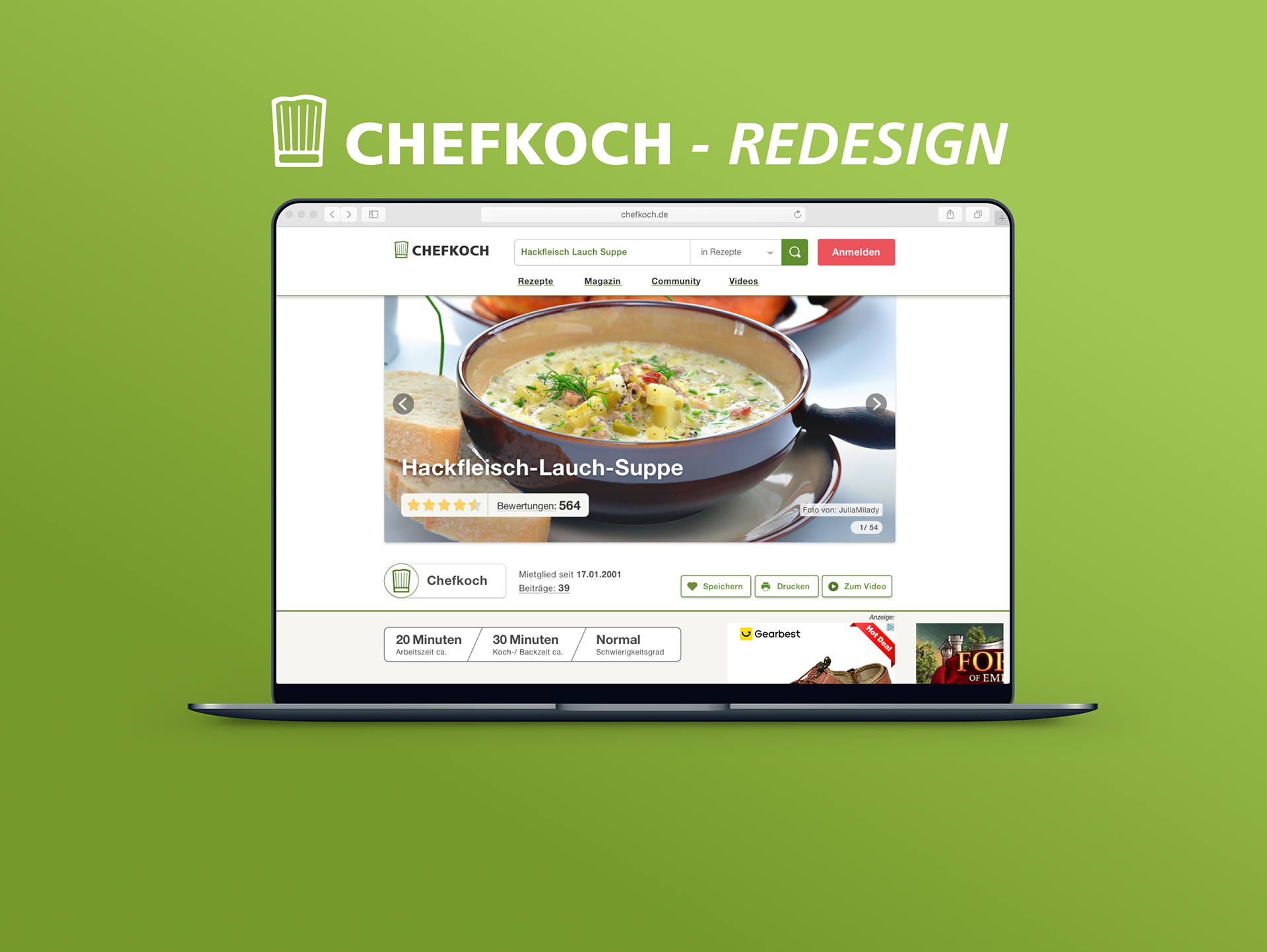
The redesign was created in the course “Digital Typography” with supervisor Frank Rausch at the University of Applied Science Potsdam. The task was to improve typographically the screen design of a bad or mediocre website or app. I had free choice of which UI screen design I wanted to improve typographically and functionality. For this project, the website Chefkoch.de was chosen because of my hobby, cooking in my free time and experimenting with recipes.
Ideas and Sketches
In my analysis of the recipe view, I looked at the most important 4 UI elements.
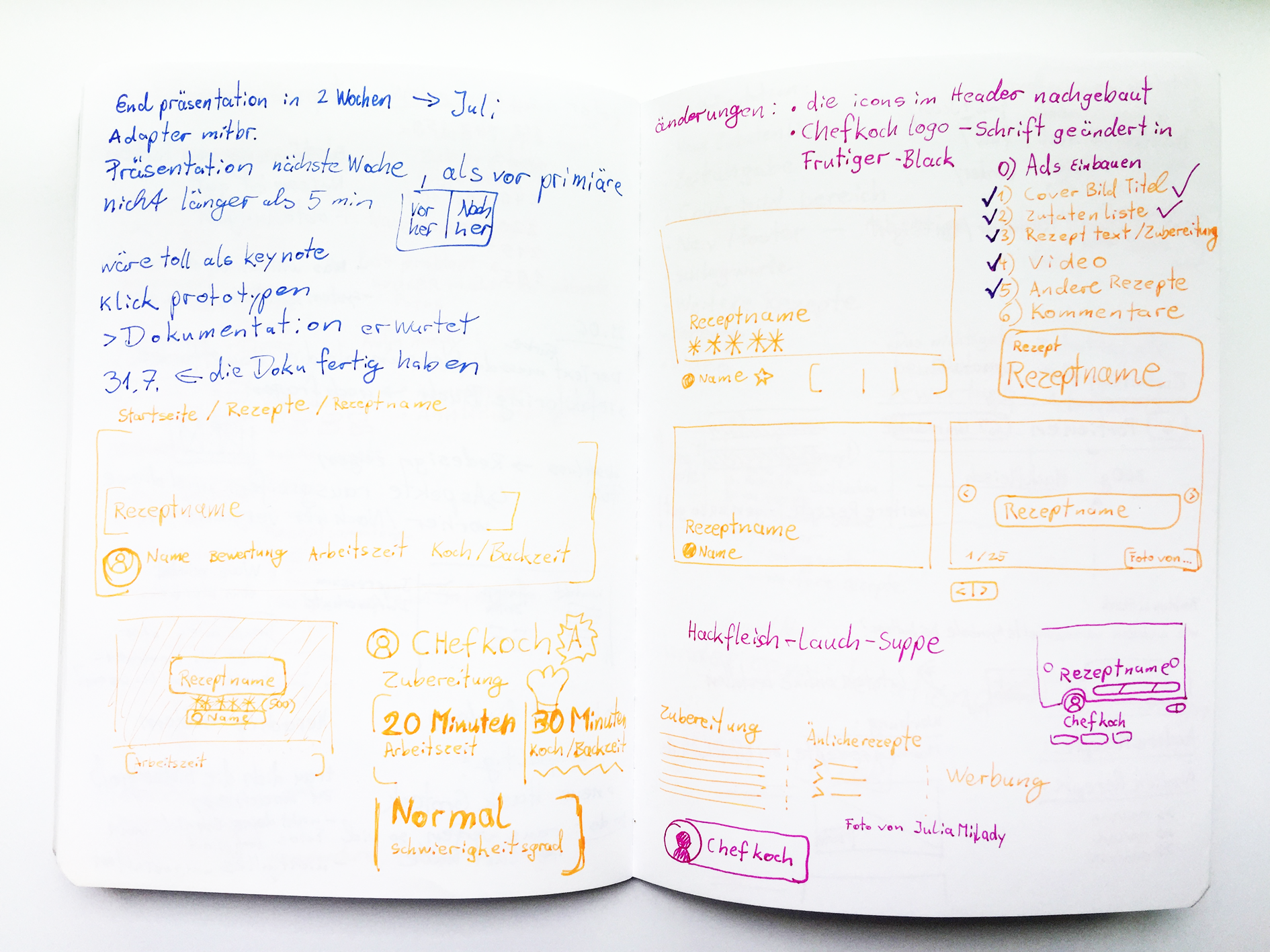
sketches for the redesign.
My Ideas for improvements
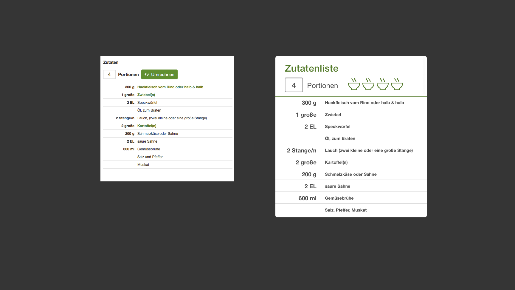
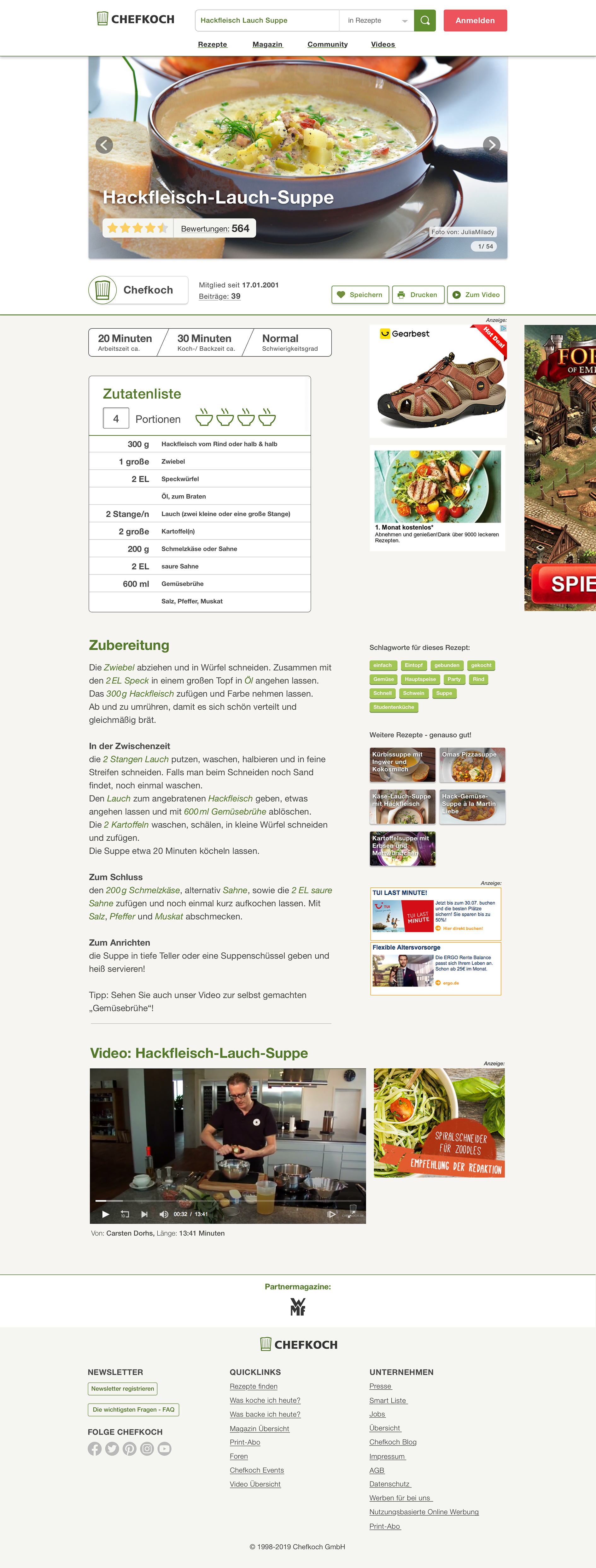
1. The ingredient list became bigger with more white space for better distance readability. I enhanced the ingredient list with a feature that automatically adjusts the quantity to the portions, without pushing an extra button.
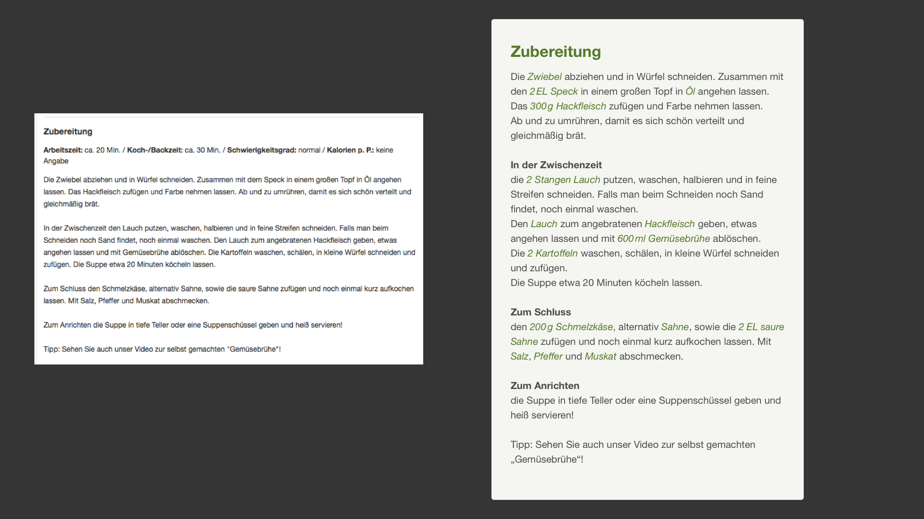
2. The text of the recipe should be connected dynamically with to list of ingredients and adjust how many quantities you need.
3. The cooking time had to be devised in preparation time, cooking time and difficulty level.
4. On Chefkoch, photos from the cooked meals are taken from the community which are often of bad quality. Therefore it should be a wise opportunity to vote for the best meal photo as the top cover photo from the community.
UI elements before and after redesign
Ingredients list, before and after
Ingredient text, before and after
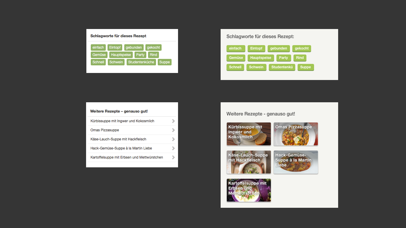
more recipe suggestions, before and after
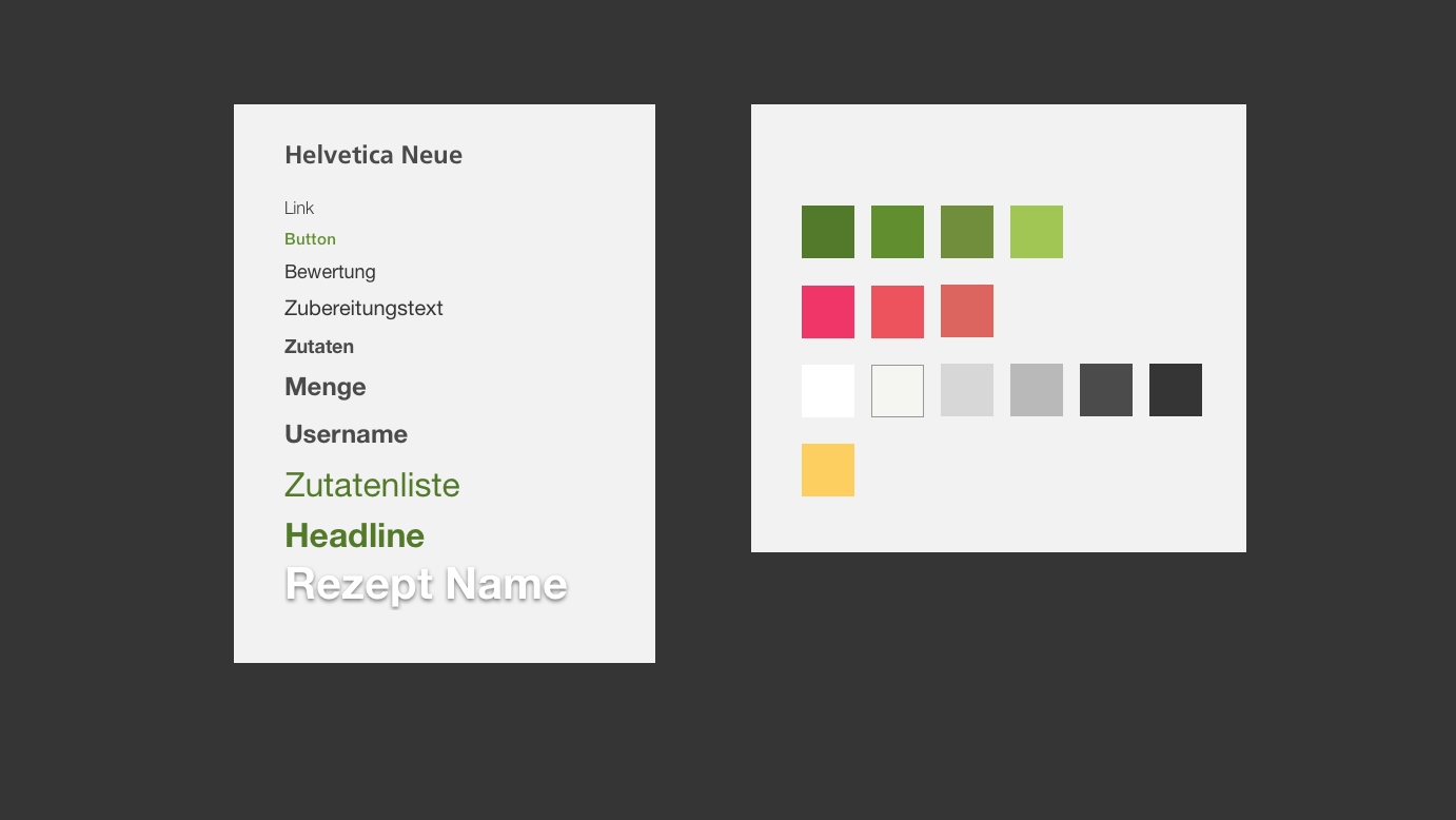
font styles and colors
The advertisements on Chefkoch
Chefkoch is a cooking website for free use. It finances itself through advertisements. The website ads are unsuitably placed.
The advertisement pictures broke the layout on the desktop screen. For my redesign, I have removed all ads and rearranged them where they fit more comfortably.
The advertisement pictures broke the layout on the desktop screen. For my redesign, I have removed all ads and rearranged them where they fit more comfortably.
Final Redesign
Summary
In the digital typography course with Frank Rausch, I was able to learn more about how digital typography influences UI design. Digital typography also communicates subliminally important functions for the user. Understanding this has helped me to improve my design skills.
1. Create orientation (Where am I? Where do I come from? Where am I going?)
2. Self-description quality (spatiality, materiality, animation).
“says with its form already the use property.”
3. Dialog with the machine (“Just ‘OK’ is not enough!”)
2. Self-description quality (spatiality, materiality, animation).
“says with its form already the use property.”
3. Dialog with the machine (“Just ‘OK’ is not enough!”)
I made a short presentation.
It is in German and was for my lesson by Frank Rausch.
It is in German and was for my lesson by Frank Rausch.